|
|||||
|
|||||
 |
|
|
|
| View GreenReport® Maps for:
1997,
1998,
1999,
2000,
2001,
2002,
2003,
2004,
2005,
2006,
2007,
2008,
2009,
2010,
2011,
2012,
2013,
2014,
2015,
2016,
2017,
2018,
2019,
2020,
2021,
2022,
2023,
2024,
2025,
2026,
|
|
Produced each week from satellite data, the GreenReport® is a set of four maps which uses the Normalized Difference Vegetation Index (NDVI) and comparison techniques to illustrate crop/vegetation condition and state of development.
|
|
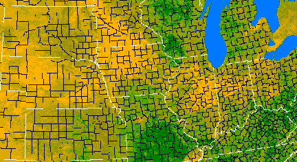
The Vegetation Index Greenness Map (Figure 1) illustrates "greenness" values. Greenness is a measure of plant material (biomass) which is actively producing chlorophyll. In this image from early May 1998, the highest concentrations of green plant material can be seen in the forested areas of Missouri and Kentucky. Lesser amounts of greenness in central Kansas and southern Illinois represent green winter wheat. The cornbelt area from western Ohio through central Nebraska is showing low greenness values, as crops in these areas have yet to emerge.
|
|
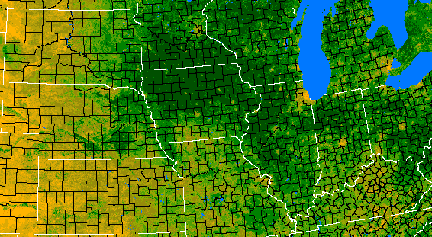
| This Vegetation Index Greenness Map (Figure 2) from early August, 1997, shows changes in greenness values from the Early-May image (Figure 1) above. Corn and soybeans throughout the central cornbelt are now at or near peak greenness, showing large areas of high greenness values. The forested areas in Missouri and Kentucky are less green than in the previous image, as forested areas reach peak greenness earlier in the season. Grasslands in the western areas of the image have lower greenness values, as there is less total green biomass in these areas.
|
|
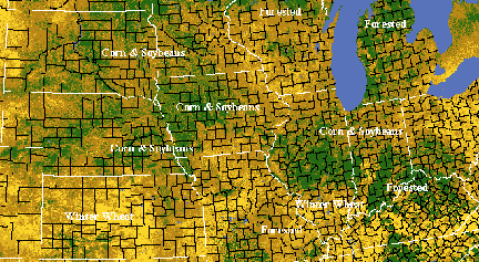
| Greenness Difference Map 1 (Figure 3) shows vegetation/crop progress by comparing the current greenness image with the previous image during the same year. This map from mid-June, 1997 is comparing greenness values to early-June, 1997, and is a good illustration of the variability of vegetation/crop growth and progress. Areas of corn and soybean growth can be seen in central Illinois, western Iowa, eastern Nebraska and southwestern Minnesota, while crop areas in eastern Iowa, and northern Illinois and Indiana are showing little change from the previous period. Winter wheat areas in central Kansas and southern Illinois are showing decreased greenness, as the wheat is browning down. Forested areas in southwestern Wisconsin and southeastern Missouri are showing slightly decreased greenness, while forested areas around the Indiana, Ohio, and Kentucky borders are showing increased greenness.
|
|
Greenness
Difference Map 2 |
 Figure
4. Greenness Difference Map 2, Period 14, March 28-April 10, 1997 compared
to the same period the previous year, showing improved winter wheat conditions. Figure
4. Greenness Difference Map 2, Period 14, March 28-April 10, 1997 compared
to the same period the previous year, showing improved winter wheat conditions. |
| Greenness Difference
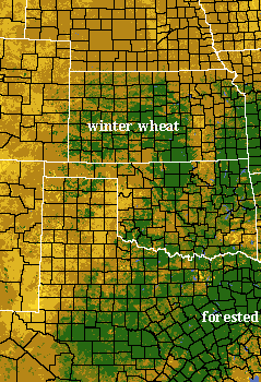
Map 3 (Figure 5) illustrates vegetation/crop conditions and progress when the current image is compared to the average from the same period. This image from early-April, 1996 is showing the poor winter wheat conditions when compared to the average for the same period. The wheat harvest for 1996 was at 50% of normal throughout the area. Grassland areas in eastern Kansas and Oklahoma are showing little or no change from the average. |
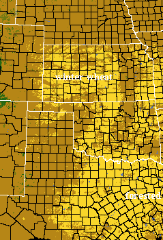
Figure 5. Greenness Difference Map 3, Period 14, March 29-April 11, 1996 compared to the average for the same period, showing poor winter wheat conditions. |